How Fitbit Could Improve Their Dashboard – UX Teardown and Redesign
In the previous post, we talked about UX design guidelines for useful health dashboards. To illustrate the outlined principles, this week we’ll have a look at a real-life example: recently redesigned Fitbit.com dashboard.
Don’t worry if you missed last week’s article, here is a quick summary of UX design guidelines for useful health dashboards:
- Design health dashboards around a single goal and prioritise the content you include with this goal in mind.
- Give the user a useful point of reference. As most self-tracking health dashboards are meant to inform the user how they are doing against their health goals or recommendations, it’s a best practice to show user metrics against a useful benchmark (their personal goal, recommended values or benchmark against other users).
- Use colour in a meaningful way. Dashboards by nature are data heavy and any additional visual elements should be used sparingly and only if they support the primary goal.
- Use the right visualisation method. Adhering to standard visualisation methods reduces the time user needs to spend analysing data and increases their understanding of presented data.
- Group data in meaningful groups. Optimise the layout for scanning and visual ‘storytelling’ by displaying data widgets in logical groups.
- Use visual elements such as colour, layout and size to communicate the priority of information and the relationship between data groups.
- Help users act upon what they see. If there is an action in your system the user can take to get closer to their goals, display that call to action close to the relevant data group.
Before we start the Fitbit dashboard evaluation, it’s worth making the following disclosure:
I have not been asked by Fitbit to perform this evaluation. It is purely an exercise performed out of my own interest in the subject and for the educational purpose of this blog. I’m performing this evaluation based on assumed goals and without any knowledge of technical or business constraints that have likely affected the current design. Any negative comments about the current design are not intended at criticizing the work by Fitbit’s designers. Design is not science and most often than not, there is no right or wrong answer.
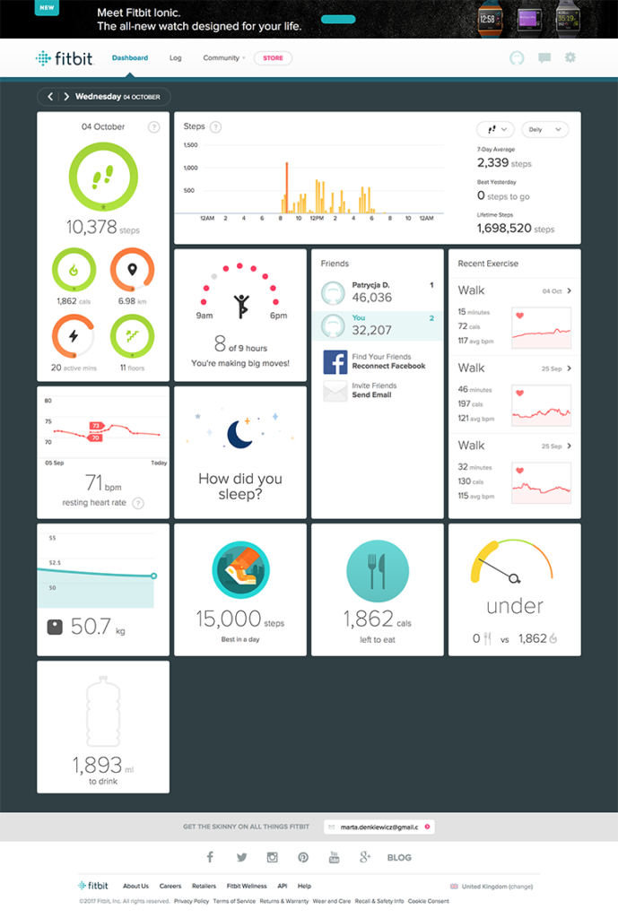
New Fitbit.com dashboard
The desktop version of Fitbit dashboard recently went through a redesign. Based on the comments of Fitbit representatives on the company’s forum, the goal of this work was to bring it closer to their mobile app version. This was definitely a step in the right direction as the two are currently much more consistent visually, providing a single experience when the user switches between their mobile and desktop view. Here’s how a current dashboard looks:
Okay, let’s break this dashboard down into details and look at them from the perspective of our UX design guidelines.
Goal orientation
For this UX evaluation, we’ll assume that the user goal for this dashboard is ‘I need to know how I’m doing against my health goals’. Based on that we can assume that the most important information from the user perspective would be:
- I want to see current metrics for today and the progress towards the goal
- If I’ve connected through the app with my friends, I want to see how we’re doing against each other
- If I’m participating in challenges or adventures I want to see the progress of those
These as of course assumed user goals for the purpose of this exercise, in a real life these should be derived from user research.
Looking at the data widget presented currently on the dashboard, the following widgets support the user goals:
- Today’s metrics for steps, calories, distance, active minutes and floors climbed
- Weekly progress towards the goal helps to assess if one’s on track to the weekly goal. It also might motivate the user to be more active even if they are behind goals on some of the days
- Friends leaderboard
- Sleep, calories consumed, water intake, weight and HR panels are useful for today’s view but I would argue they are of a secondary priority because they (a) don’t change very frequently, (b) require some sort of user input before they can be used or (c) there is no clear correlation between the metric and the user goal.
The panels for recent exercise and badges are useful in general but in order to maintain the clarity of the dashboard and minimise the amount of information that competes for user attention, they probably should be removed to the secondary level of navigation or other parts of the system. They aren’t immediately required on the first view.
The panel for daily breakdown could also be delegated to secondary view (second level of navigation or an overlay) to reinforce the hierarchy between today’s summary and a breakdown of those metrics. Using the interaction design principle of ‘progressive disclosure’ we can minimize initial cognitive load and present the user with the summary view first and then let them drill down into the detail if they are interested in doing so.
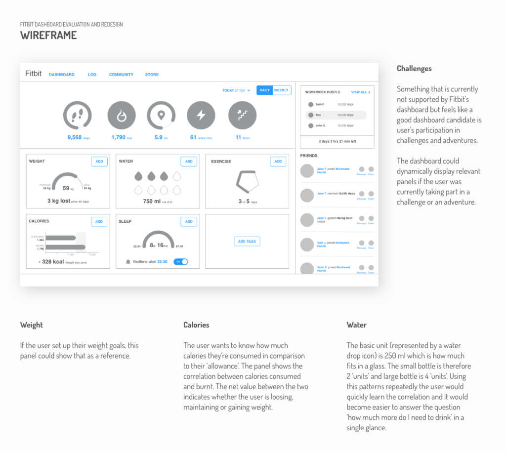
Additionally, something that is currently not supported by Fitbit’s dashboard but feels like a good dashboard candidate is user’s participation in challenges and adventures. Challenges are daily competitions between two or more Fitbit users and Adventures are gamified experiences where a single user is following a ‘virtual path’ and uncovering ‘milestones’ along the way. The dashboard could dynamically display relevant panels if the user was currently taking part in a challenge or an adventure.
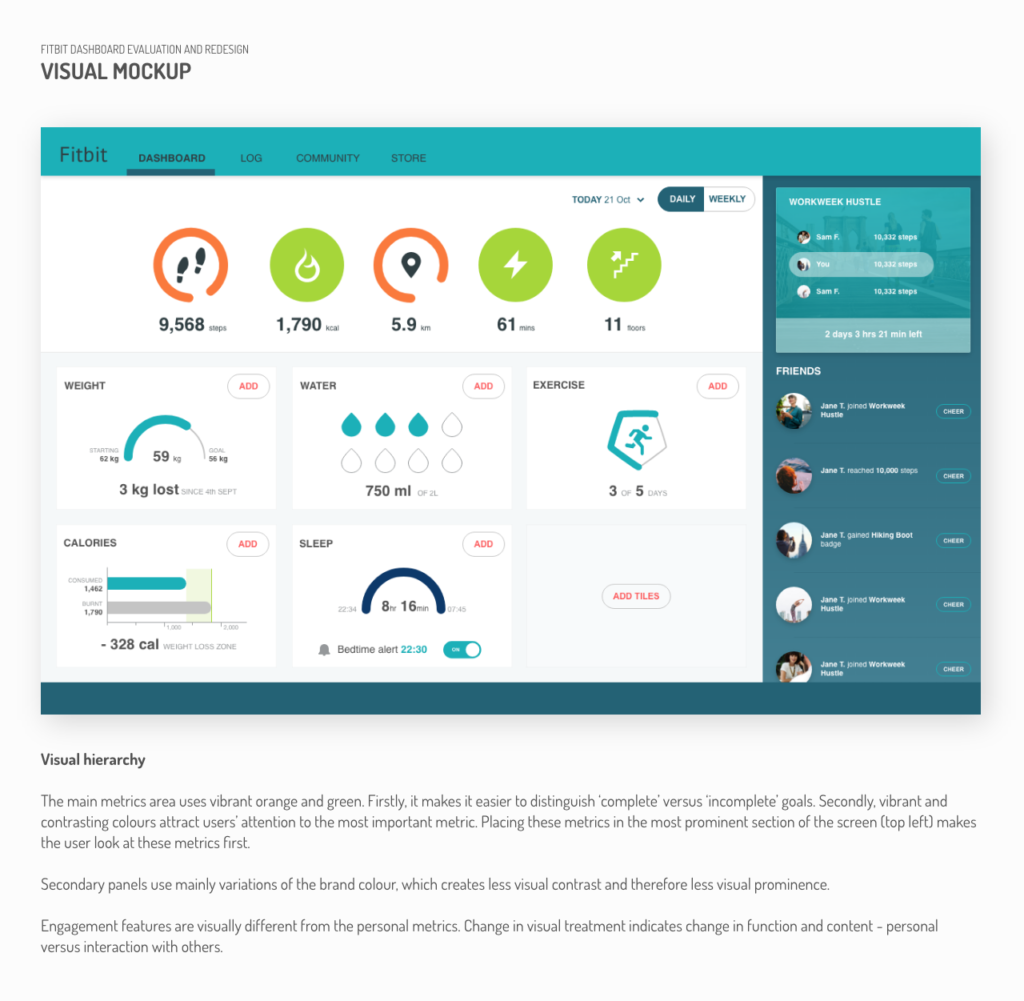
Visual hierarchy and storytelling
Perhaps the biggest weakness of the current dashboard is the lack of visual hierarchy. All data widgets carry the same visual weight and they don’t seem to be organized in any logical groups. Perhaps this was an explicit decision to enable the user to personalise the dashboard as they wish. Personalisation is a popular pattern for dashboards and other interactive systems but I believe it is also often overused. Provided that we did user research and we are confident with our knowledge of user goals and priorities, we should provide that ideal state by default. Exceptions include systems that have highly varied user base or those that have to support power users who might want frequently access advanced features. For the Fitbit dashboard, I believe a better approach would be to prioritise and organize data widgets by default and the optionally allow the user to make changes.
Based on the assumed user goals, I would propose to use different sections of the dashboard for groups of data and assign them a different visual priority. The dashboard could be broken down into:
- Today’s metrics
- Main metrics tracked automatically
- Secondary metrics that need user input
- Weekly progress
- ‘Engagement’ features
- Leaderboard
- Challenges
- Adventures
Challenges and Adventures are slightly different than other panels as they are context dependent – they are timely ‘events’ that user might or might not participate in during any period of time. Therefore, there are two ways they could be approached. They could have a static place on the dashboard regardless if the user is currently participating in one. For the time when the user isn’t, there could be a call to action encouraging the user to participate in one to increase user engagement in the app. Alternatively, they could be dynamically displayed only if the user is currently participating in one. In that case, they could be temporarily promoted to a prominent place on the dashboard to create a sense of excitement and of participation in something special.
Applying more visual prominence to the key elements would add a sense of ‘storytelling’ by guiding the user to look at the most important information first and subsequently move on to the order bits of information.
The overall use of colour on the dashboard is correct and it emphasises the benchmarks for specific values (e.g. heart rate zones) or indicates the completeness of a goal (e.g. main statistics turn from orange to green when the goal is completed).
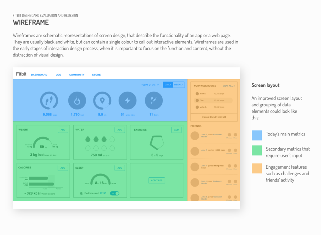
Here is a wireframe of how the widgets could be reorganised to create a more logical grouping.
Visualisation methods
The use of donut charts works well for today’s main statistics. The user can assess with a single glance where they’ve met their goals and where they have a little bit more to go. The only weakness is a poorer readability for colourblind users. The panel heavily relies on the distinction between the red and green to assess the completeness of a goal. One way of improving that visibility would be to change the donut chart to a full circle once the goal is met. This would further visually emphasize the ‘complete’ versus ‘incomplete’ state of the metric.
The daily breakdown panel uses a bar graph for all the metrics except the heart rate. Although there is nothing inherently wrong in using the bar graph for this type of data, using the line graph for all of them would bring extra consistency to the display. The recommended visualisation method for displaying changes over time is actually a line graph, so it would make sense to align all metrics to this method. Using the line graph instead of bar graph would also open up opportunities for displaying useful comparisons e.g. overlaying today’s breakdown over last week/month average would help the user to see their improvement over time.
The single heart rate panel uses line chart again but it is visually different from the HR panel used in the daily breakdown. The daily breakdown HR graph also shows the link differentiating different HR zones which adds useful context for the user. Apart from the visual inconsistency, it’s also unclear what is the purpose of the monthly HR panel. It shows the highest and lowest value over the last month but what does it mean for the user? It could definitely be improved making it more informative and insightful for the user in terms of what this ‘score’ actually means.
Also, the weight panel is lacking some useful reference point for the user. If the user has set up their weight goals, this panel could show that as a reference. Alternatively, it could display the weight against the BMI or another standard metric. The graph itself doesn’t have a time value so it is unclear what it is actually showing. It is almost redundant as the most useful information in this panel is the current weight which is displayed in the numerical value anyway. This is also one of the panels that require user input before they are actually useful or up to date. The call to action could be displayed if the user hasn’t updated their weight for a while.
The water intake panel uses a visual metaphor of a water bottle to show the progress. It is a nice, real-life parallel, which is more usable for people than abstract millilitres. On the other hand, people don’t usually drink from 2-litre bottles, so it is somehow difficult to judge how much more user needs to drink to complete the goal. The interaction of adding consumed water, however, uses a metaphor of a glass, small bottle and large (1 litre) bottle which are actually more relatable for people. To build upon that metaphor, we could add a reference to the units used in ‘add’ flow to the dashboard panel. The basic unit is 250 ml which is how much fits in a glass. The small bottle is therefore 2 ‘units’ and large bottle is 4 ‘units’. Using this patterns repeatedly the user would quickly learn the correlations and it would become easier to answer the question ‘how much more do I need to drink’ in a single glance.
The calories consumed panel and the gauge panel are servicing essentially the same goal. The user wants to know how much calories they’re consumed in comparison to their ‘allowance’. I would then recommend combining those two panels in a single panel showing a clear correlation between calories consumed versus calories burnt. Based on user’s goal (lose, maintain, or gain weight) the relevant target point would be displayed.
Here is a wireframe of how the specific data widgets could be redesigned.
Proposed solution
To conclude our evaluation, below is the draft visual mockup of proposed changes. As I mentioned before, this by no means is the only ‘correct’ solution. Design by nature is subjective, even though usability is somewhat more quantified and science-based than other design disciplines. So much depends on the context and the constraints within which the design was conceived, that there is rarely one ‘right’ answer.
I would LOVE to hear what you think of the proposed changes, so please leave the comments below or tweet me at @panacea_digital.